Methodologies (cont'd)
Whereas the previously mentioned Digg front page analysis looked at the top 15 stories each day for the month of October 2009, this study aimed for a much larger sample size, in order to achieve stronger, more reliable results. From June 2010 until May 2011, the top 225 stories (influenced by the initial choice of 15 stories a day; instead it was now chosen to look at 15 pages worth of stories, each with 15 individual items) from Digg’s front page were recorded into a database at the end of each month.
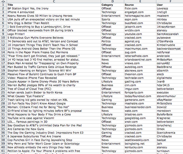
The process itself, compared to the process in the previous study, went mostly unchanged. On the last day of each month, Digg’s front page filter was changed to display the top posts of the month, as opposed to the top stories of the day. Along with this, the posts were filtered to show ‘stories’ – excluding posts that consisted of humorous photos or memes, which are often more popular on Digg than news itself. Once filtered, the posts were screen captured, and saved into a layered Photoshop file, with a file naming structure of “YYYY/MM Month” to maintain chronological organization among files. For 12 months, this process was repeated, with the last recording of data taking place on May 31st, 2011.
Once the 12 months worth of data had been recorded, the data was the transcribed into a sortable database, with which a user can sort by any of the five recorded variables (date, diggs, headline, category, source or user). From this point, analysis of the recorded data was made possible by the online text analysis tool Voyeur Tools. With this tool, frequencies of data appearances were able to be displayed, allowing for the dissemination of the raw data into hard numbers, showing what was popular on Digg’s front page (in terms of topic of story, category of story, source of story and user) for each month of the year, and the year overall.
|